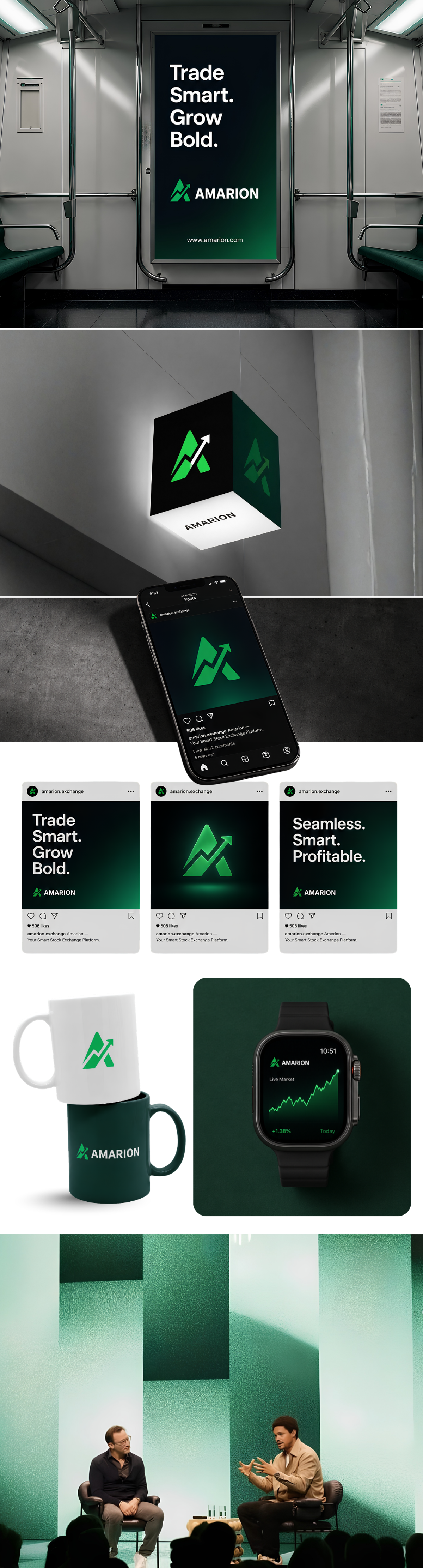
A showcase of digital products and brand experiences we've built for our clients.
3wk
Delivery Time
5
Concepts Explored
100%
Client Satisfaction
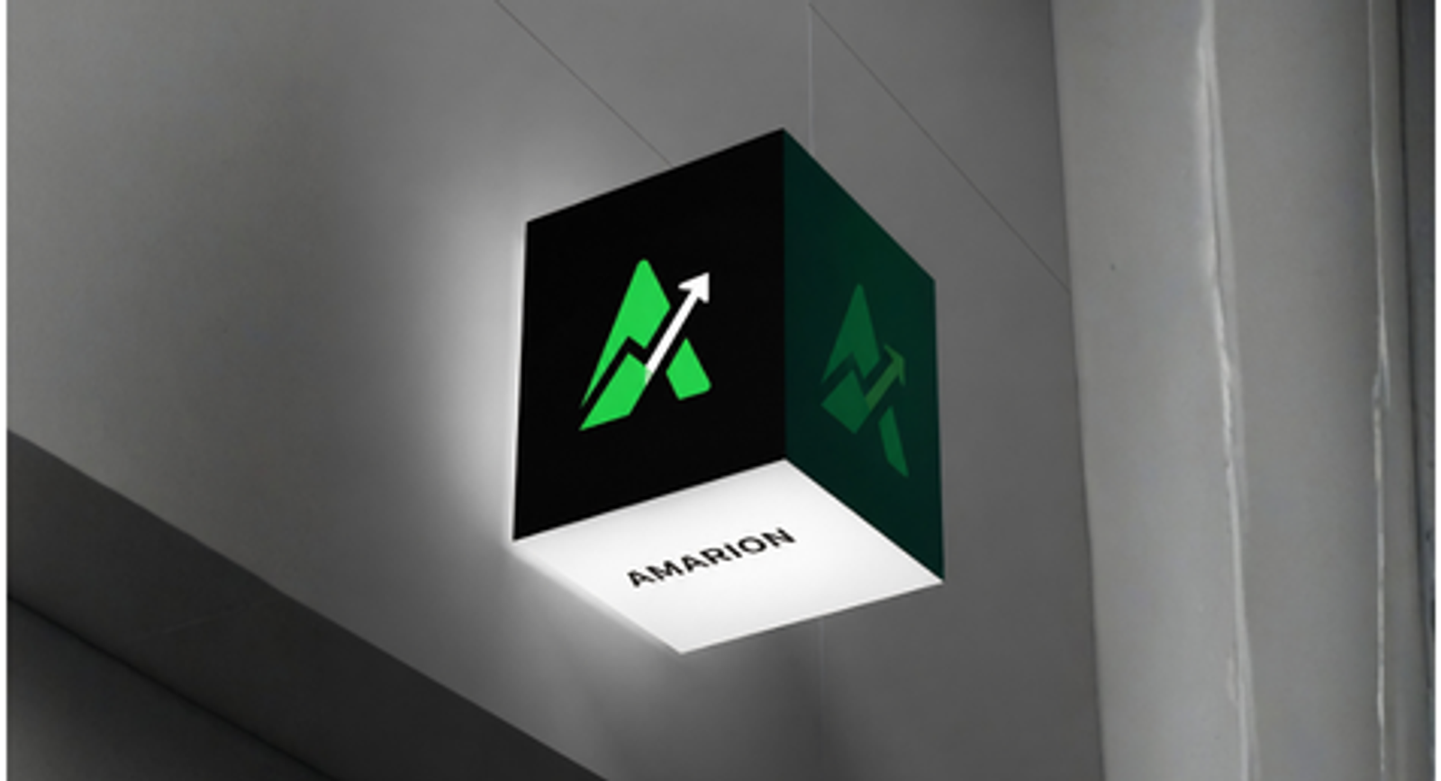
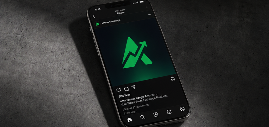
Amarion is a professional and trustworthy stock exchange platform that empowers traders with accurate market data, advanced tools, and real-time insights. Every element of the logo carries a message — stability, growth, and intelligent investing. The brand speaks to both seasoned traders and new investors looking for a reliable platform to grow their wealth.
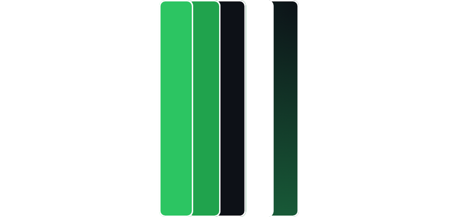
#2CC562 — Primary Green
The hero color. Bright, energetic, and instantly recognizable as 'profit'. Used for the logo, key buttons, highlights, and bullish price indicators.
#20A34D — Secondary Green
The grounded partner to the primary. Slightly deeper and more confident — used for hover states, gradients, borders, and supporting UI elements. Adds visual depth without losing the green identity.
#0D1117 — Navy Black
The foundation. Every serious trading platform lives on a dark background — it reduces eye strain during long sessions and makes price data and charts easier to read. This is Amarion's primary background color.
#FFFFFF — Pure White
Clarity and precision. Used for typography, icons, and data labels. Maximum contrast against the dark background ensures nothing is missed by the trader.
#F25C38 — Signature Depth
This is Amarion's secret weapon. A subtle shift from near black to a deep forest green — used on hero sections, card backgrounds, sidebars, or onboarding screens. It tells the story of the brand in one sweep: from darkness into growth. No other competitor will have this — it's uniquely Amarion.